Facilitator guide
Case objectives, demonstration plans, debriefs, common mistakes and application checks across all 81 workplace cases and method lessons.
Download Facilitator guide PDF · 166 pages · 65.1 MB OPEXSTUDIO
Choose one basis: count, cost, time or another defined burden.. Follow the visual, practise a decision, then check your thinking.
Fictional teaching examples and AI-generated illustrations. Proposed changes and goals are not achieved results. Use the written instructions and check local conditions before applying a method.
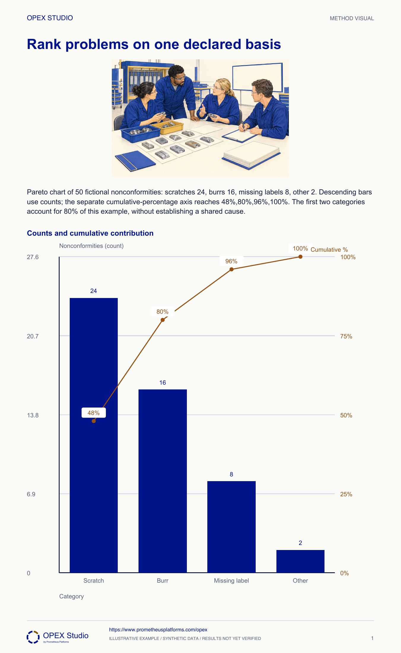
A Pareto display ranks categories using one declared basis. Sort the bars from largest to smallest, then calculate cumulative share against the same total. Decide whether the current question concerns frequency, money, time or another burden before drawing the chart. Mixing costs for one category with counts for another produces an invalid ranking. The cumulative line helps show concentration, but it does not promise an eighty–twenty pattern or justify ignoring rare severe events. Use the ranking to select an investigation, then return to the underlying observations and risk context before deciding what to change.
Counts 24,16,8,2 sum to 50.
Cumulative percentages 48,80,96,100.
Use one basis; a severe rare event can still demand priority.
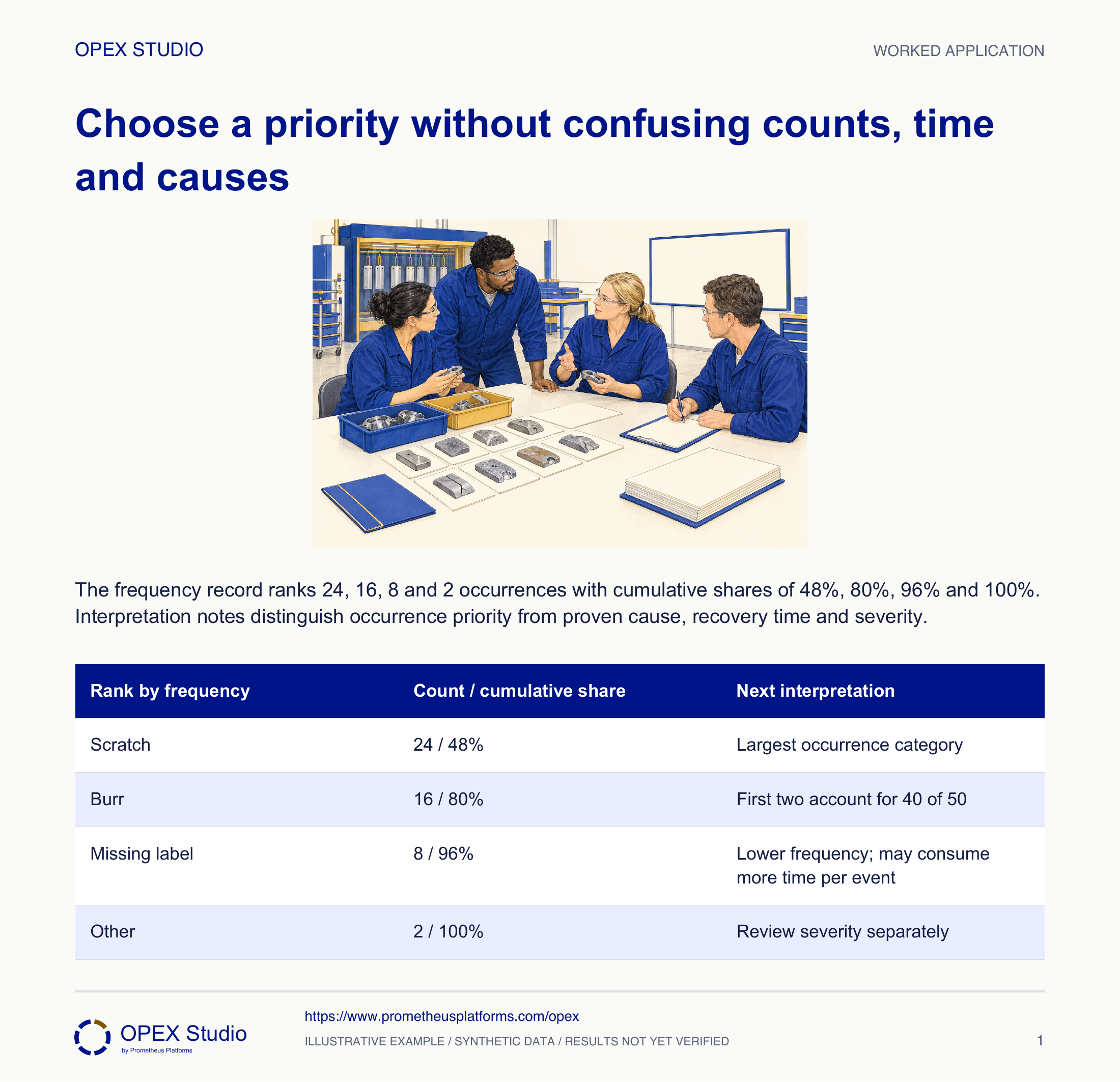
Fictional case: Fern Finishing records 50 nonconformities in one inspection window: 24 scratches, 16 burrs, eight missing labels and two other faults. These exact values remain in the core chart. Team leader Rosa wants to choose a starting investigation. A colleague proposes adding estimated repair dollars to the occurrence counts and calling the combined bars an impact score.
Use the applicable immediate escalation and containment process while retaining the descriptive frequency ranking. Do not wait for its bar to become large.
Frequency is one decision dimension. A Pareto chart does not authorize ignoring a severe low-frequency condition.
Construct and interpret a ranking on one declared basis, then distinguish a frequency priority from a severity or causal decision.
Fictional case: Fern Finishing records 50 nonconformities in one inspection window: 24 scratches, 16 burrs, eight missing labels and two other faults. These exact values remain in the core chart. Team leader Rosa wants to choose a starting investigation. A colleague proposes adding estimated repair dollars to the occurrence counts and calling the combined bars an impact score.
Role: Team leader and quality analyst
A ranking uses one meaningful unit, a defined observation window and mutually understood categories. The underlying event list remains available for investigation.
The draft mixes frequency and money and labels the first two categories “80% of our causes”. The record contains occurrences, not verified causes.
| Category | Count | Illustrative recovery minutes per event |
|---|---|---|
| Scratch | 24 | 2 |
| Burr | 16 | 5 |
| Missing label | 8 | 10 |
| Other | 2 | 30 |
Rosa writes “Which categories contribute most recorded nonconformity occurrences in this window?” She confirms that all four categories use the same recording rules and the same window.
Why: The ranking becomes reproducible only when its scope and unit are fixed. A category total cannot be compared with another that covers a different period or population.
Evidence: The title says occurrence count and names the window.
She sorts counts in descending order: 24, 16, 8, 2. The sum is 50. She checks that every logged event belongs to one reported category or is explicitly handled under the collection rule.
Why: Sorting changes display order, not the underlying evidence. A missing category would distort every later cumulative percentage.
Evidence: The category total reconciles to fifty recorded nonconformities.
Cumulative counts are 24, 40, 48 and 50. Dividing each by 50 gives 48%, 80%, 96% and 100%. The line uses its own percentage axis.
Why: The first two bars happen to reach 80% in this dataset. That is an observation, not a rule that the plotting process must force.
Evidence: The native chart retains count bars and a labelled cumulative-percentage axis.
For recovery effort, she creates a separate minutes calculation: 48, 80, 80 and 60 minutes. Total estimated recovery is 268 minutes; burrs and missing labels tie for the largest time burden.
Why: Multiplying count by an explicitly illustrative per-event duration changes the question. It shows why a frequency ranking need not be the correct priority for every objective.
Evidence: A second record states minutes, assumptions and its different order; no mixed-unit score is created.
Rosa selects scratches for a frequency-focused observation study and flags any severe exceptions through the existing response process. She keeps the rival time-based priority visible for the resource decision.
Why: A category name does not explain why the fault occurs. The next work must locate conditions, test explanations and verify the consequence of an action.
Evidence: The decision record says priority for investigation, with cause still unverified.
| Rank by frequency | Count / cumulative share | Next interpretation |
|---|---|---|
| Scratch | 24 / 48% | Largest occurrence category |
| Burr | 16 / 80% | First two account for 40 of 50 |
| Missing label | 8 / 96% | Lower frequency; may consume more time per event |
| Other | 2 / 100% | Review severity separately |
One of the two “other” events involves a potentially significant product risk.
Use the applicable immediate escalation and containment process while retaining the descriptive frequency ranking. Do not wait for its bar to become large.
Frequency is one decision dimension. A Pareto chart does not authorize ignoring a severe low-frequency condition.
The action log records the risk response independently of the improvement-priority list.
New fictional week: scratches 12, burrs 18, missing labels 6, other 4. Each event belongs to one category. Recovery minutes per event remain 2, 5, 10 and 30 for this exercise only.
| Category | Count |
|---|---|
| Scratch | 12 |
| Burr | 18 |
| Missing label | 6 |
| Other | 4 |
Forty events sort as burr 18, scratch 12, missing label 6, other 4. Cumulative percentages are 45%, 75%, 90% and 100%.
Recovery minutes are scratch 24, burr 90, missing label 60 and other 120, total 294. “Other” is the largest time burden despite the lowest frequency. A team may investigate burr frequency and separately examine the high-time “other” work.
| Frequency rank | Count | Cumulative percentage |
|---|---|---|
| Burr | 18 | 45% |
| Scratch | 12 | 75% |
| Missing label | 6 | 90% |
| Other | 4 | 100% |
Which unit is being ranked?
Why must minutes not be added to counts?
Where does the cumulative line finish and why?
Which decision is outside this frequency chart?
Sort paper category cards, calculate cumulative totals, then open the answer.
Owner: Quality analyst and improvement sponsor
Record: Ranked source-linked chart plus bounded investigation decision
Review: At each comparable reporting window
Evidence: Same basis, complete categories and actual investigation evidence
Revisit collection definitions or choose a different basis when the decision question changes.
Rank category totals on one stated measurement basis; cumulative percentages are optional and end at 100%.
Public primary-source summary; underlying paid standards/forms are not reproduced.Read the lessons online or use these PDFs to prepare, practise and review with your team. No sign-in needed.
Case objectives, demonstration plans, debriefs, common mistakes and application checks across all 81 workplace cases and method lessons.
Download Facilitator guide PDF · 166 pages · 65.1 MBPrintable case worksheets, blank observation records and five calculation exercises; answers are separate.
Download Learner workbook PDF · 169 pages · 10.7 MBReasoned sample responses, worked calculations and coaching guidance; fictional examples are clearly labelled.
Download Answer key and coaching notes PDF · 105 pages · 8.5 MBThe native method mechanisms and worked applications for all 68 detailed lessons, in a separate bookmarked portrait reference.
Download Method and application reference PDF · 141 pages · 10.2 MBFive illustrated system chapters: 15 Flare concept maps and 26 original workplace teaching cards, with links to all 81 supporting cases and method lessons.
Download Illustrated systems atlas PDF · 69 pages · 55.8 MBExplore this connected method and its separate application conditions.
Explore the connected method →Explore this connected method and its separate application conditions.
Explore the connected method →